border-radius圆角的详细使用
border-radius圆角边框是CSS3的新属性,以前网页设计开发中要实现元素的圆角边框,通常是用背景图片来实现的。现在我们只需要给元素添加border-radius属性即可。
兼容性
它是CSS3的新属性,兼容IE9+,Firefox 4+、Chrome、Safari 5+ 以及 Opera浏览器,对于一些较低版本的浏览器,我们可以添加相应的浏览器前缀来兼容。
div {
width: 500px;
height: 300px;
border: 1px solid black;
-webkit-border-radius: 50%;
-moz-border-radius: 50%;
-o-border-radius: 50%;
-ms-border-radius: 50%;
}

语法:
border-radius:length/persentage;
js语法:object.style.borderRadius="5px"
它的属性参数值表示有多种方式,下面就为大家一一介绍。
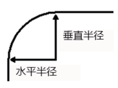
最常见的一种表现形式是一个值。如border-radius:6px;
它表示元素四个方向的圆角大小都是6px,即每个圆角的“水平半径”和“垂直半半径”都设置为6px;
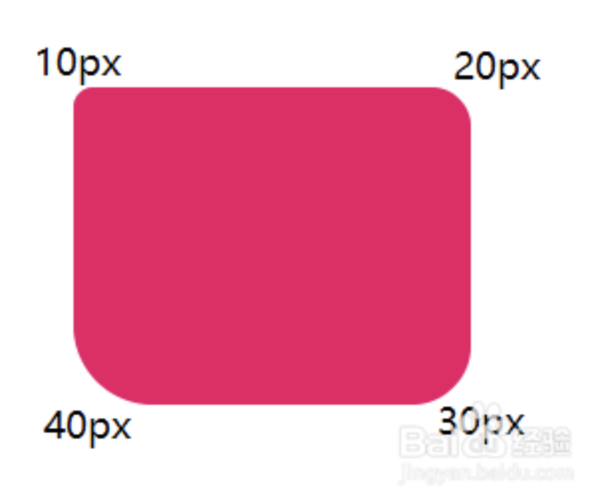
四个属性值
分别表示左上角、右上角、右下角、左下角的圆角大小(顺时针方向)
border-radius:10px 20px 30px 40px;
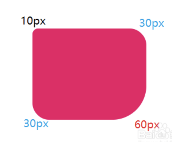
三个属性值
第一个值表示左上角,第二个值表示右上角和左下角(对角),第三个值表示右下角。
border-radius:10px 30px 60px;
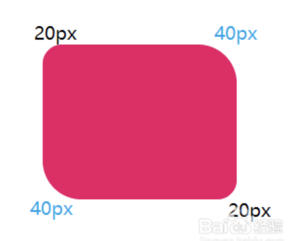
两个属性值
第一个值表示左上角和右下角,第二个值表示右上角和左下角。
border-radius:20px 40px;
斜杠二组值
第一组值表示水平半径,第二组值表示垂直半径,每组值也可以同时设置1到4个值,规则与上面相同。斜杠前面指定X值,后面指定Y值
border-radius:100px/40px;
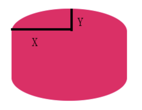
border-radius:60px 60px 60px 60px/100px 100px 60px 60px; /前 四组值为X 后4组值为Y
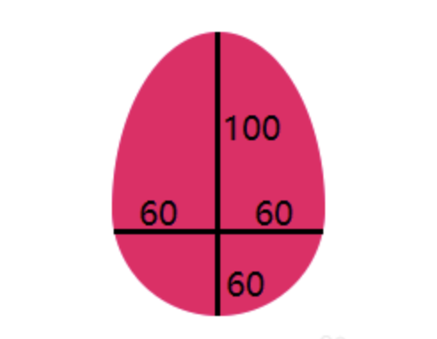
CSS样式:
.egg{
  width: 120px;
   height: 160px;
   background: #EC0465;
   border-radius: 60px 60px 60px 60px/100px 100px 60px 60px;
}
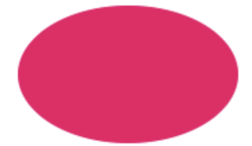
实际运用
实心圆
.circle{
  width: 120px;
   height: 120px;
   background: #EC0465;
   border-radius: 100%;
}

半圆
.lf-self-circle {
   width: 60px;
   height: 120px;
   background: #EC0465;
   border-radius: 60px 0 0 60px;
}

扇形
.quarter-botlf-cir {
   width: 60px;
   height: 60px;
   background: #EC0465;
   border-radius: 0 0 0 60px;
}

花瓣
.flower {
   width: 120px;
   height: 120px;
   background: #EC0465;
   border-radius: 60px 60px 0 60px;
}

胶囊
.level-capsule {
   width: 160px;
   height: 100px;
   border-radius: 50px;
   background: #EC0465;
}

椭圆
.ty{
   width: 160px;
   height: 100px;
   background: #EC0465;
   border-radius: 80px/50px;
}
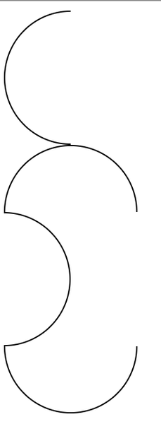
圆弧
.circle1 {
    width: 50px;
    height: 100px;
    border: 1px solid black;
    border-radius: 100% 0 0 100%/50%;
    border-right: none;
}
.circle2 {
    width: 100px;
    height: 50px;
    border: 1px solid black;
    border-radius: 50% 50% 0 0/100% 100% 0 0;
    border-bottom: none;
}
.circle3 {
    width: 50px;
    height: 100px;
    border: 1px solid black;
    border-radius: 0 100% 100% 0/50%;
    border-left: none;
}
.circle4 {
    width: 100px;
    height: 50px;
    border: 1px solid black;
    border-radius: 0 0 50% 50%/0 0 100% 100% ;
    border-top: none;
}
文档信息
版权声明:可自由转载(请注明转载出处)-非商用-非衍生
发表时间:2019年6月29日 08:39